"Barrel Aged Faith exists to share the beauty of the Ancient Faith in order to renew the World’s Future. Although many people may think of Christianity as ‘expired and outdated,’ we believe that the barrels of ancient, apostolic Christianity have ‘aged’ well and still refresh the world." - Barrel Aged Faith Statement
The client requested a logo and branding for his new podcast. This case study navigates through the challenges of this project and the critical thinking and creative problem-solving strategies I executed to exceed the expectations of my client.
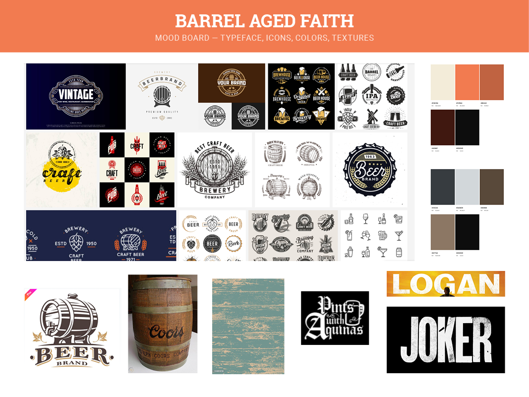
The mood board explores textures, icons, colors, and typefaces.
Keywords I searched for in my research: aging, fermenting, weathered, craft
Challenges: modernizing and creating a fresh aesthetic for the aging theme
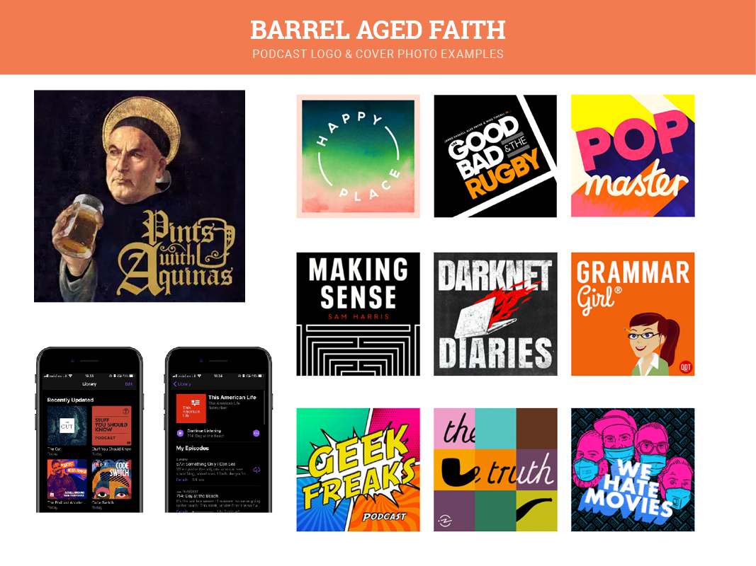
I saved podcast covers and logos for inspiration, focusing on eye-catching logos and podcast covers boasting bright colors, simple design, and legibility.
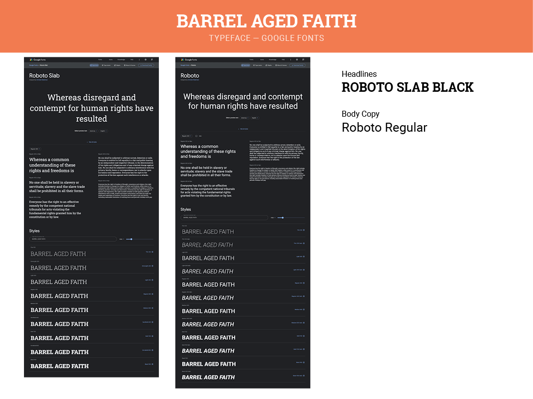
I chose to use the Roboto typeface, which has a wide array of fonts that can be used as headers and body copy. I selected Roboto Slab Black for the logo and headers as the slab mimics many old beer labels but with a modern, up-to-date approach.
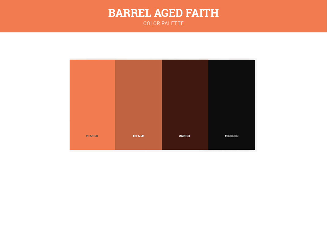
I avoided using literal beer colors like dull browns and yellows. A bright, yet aging color scheme was needed. I searched Adobe Color and found this harvest-like orange palette as the perfect fit. It flaunts the presence of the changing colors of autumn which represents the transformation process in beer fermentation.
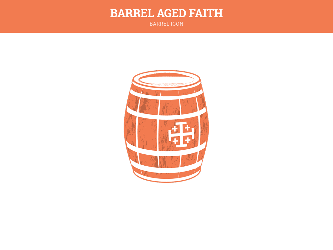
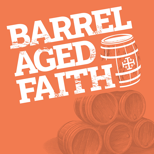
I originally had a barrel with no symbol on it but saw an opportunity to add one if it helped the client's Catholic narrative. I reached out to him and he said the Jerusalem Cross would be iconic and recognizable to further enhance the podcast's message.
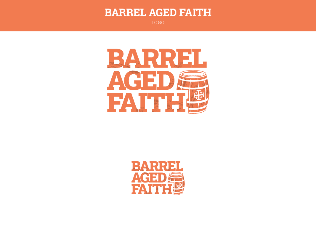
The final logo received positive reviews and the client was extremely happy with the outcome.
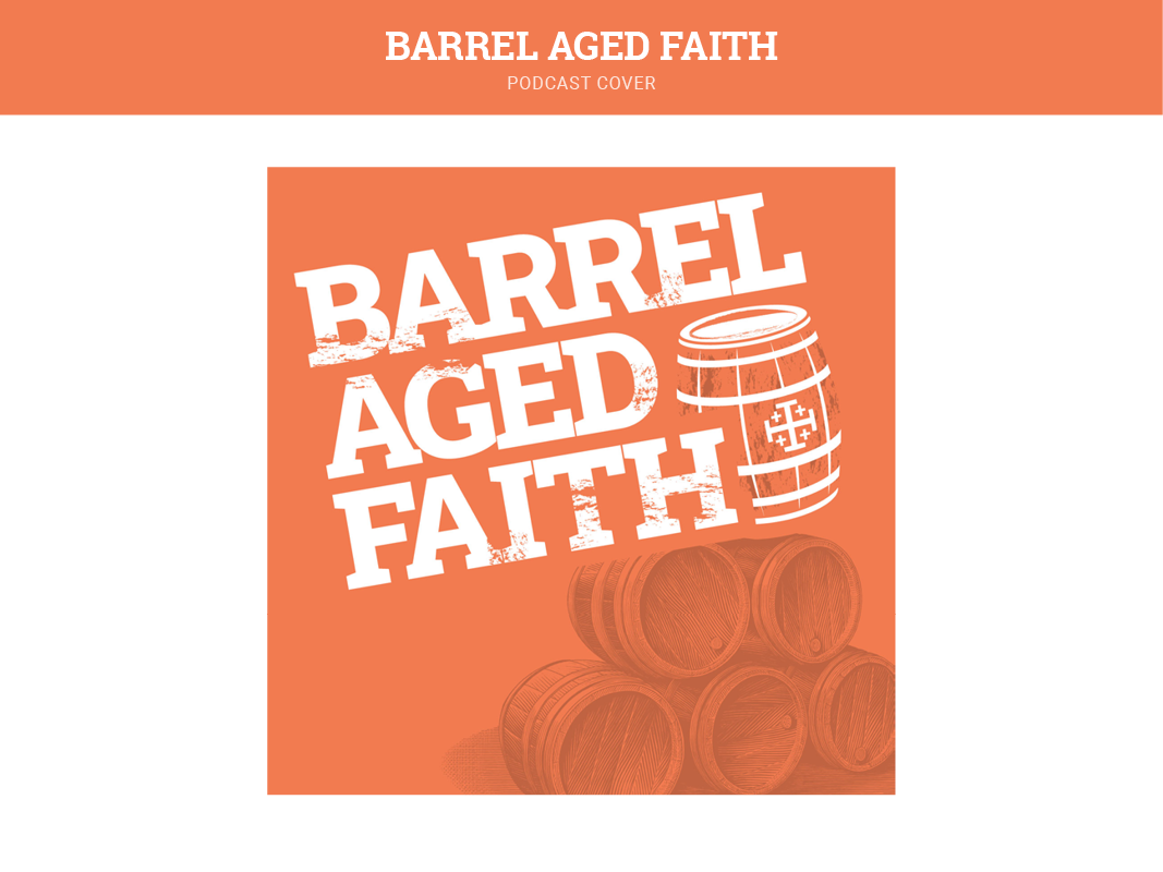
The final podcast cover is eye-catching and distinct while representing the client's need for a refreshing brand that takes pride in its aged but timeless message.